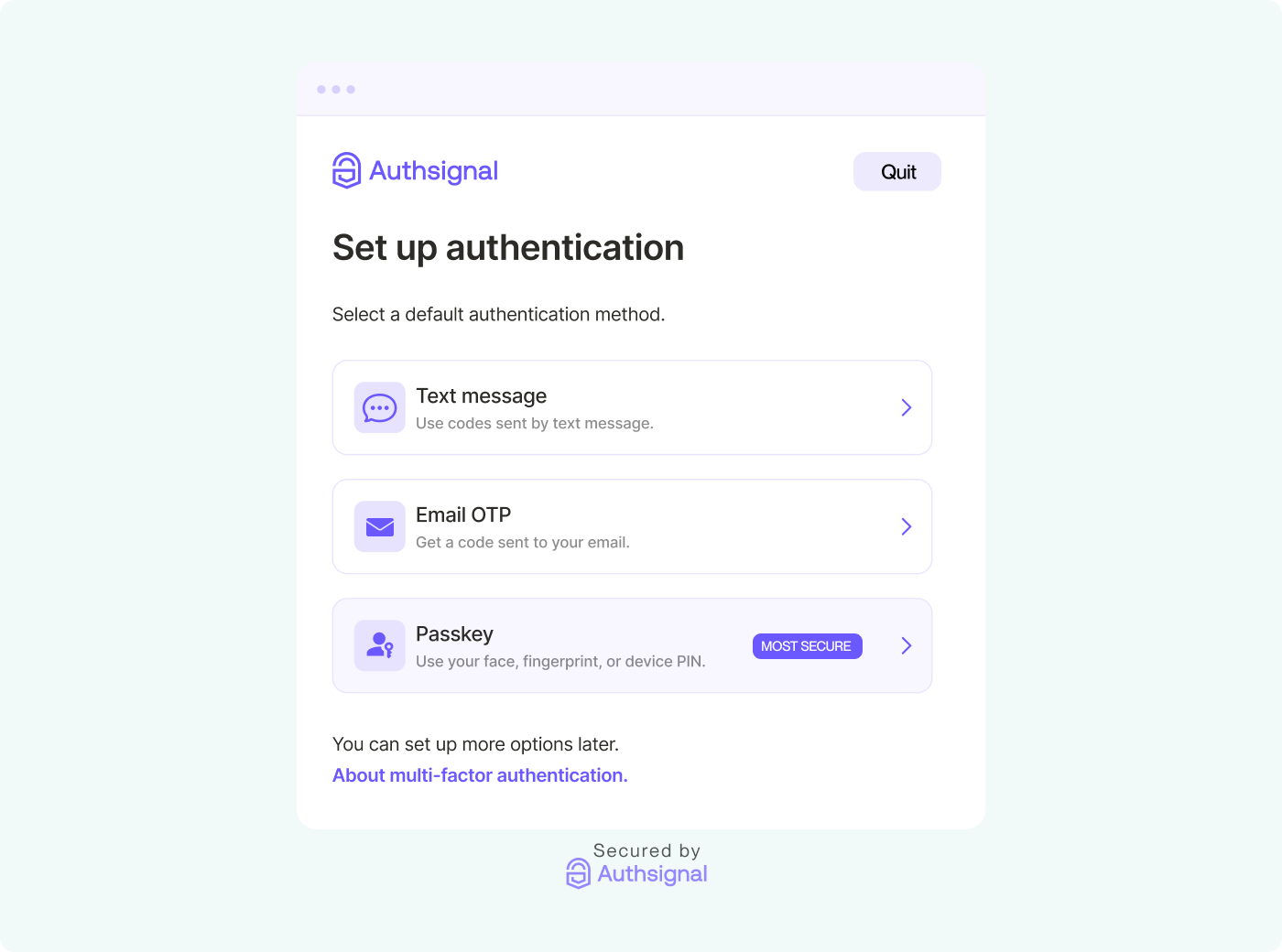
Authsignal's pre-built UI handles enrollment and verification for passkeys, SMS, email OTP and authenticator apps, so you don't have to build those screens yourself. Most teams still want those screens to look like the rest of their product, and the pre-built UI gives you more control over that than you might expect.
To see how much, we built four themes on the same tenant: one modeled on Google's sign-in page, one on Vercel's dashboard, a neo-brutalist design, and a Windows 98 desktop. This post covers what each one needed, from settings you can change in the Portal to a custom template with your own CSS and HTML.
How theming works
Everything about the pre-built UI's appearance is stored in the tenant's theme, which has two parts.
The first is a set of design tokens. These cover colors for buttons, cards, inputs, text and links, border widths and radii, fonts, logo placement and the page background. There's also a second set of colors that's used when the visitor's device is in dark mode. You can edit all of them in the Portal under Branding.
The second is an optional custom template: an HTML document that the pre-built UI renders inside. CSS in the template applies to the widget as well, so it can restyle anything the tokens don't reach. The template only has to include two tags:
<html>
  <head>
    <authsignal-head></authsignal-head>
    <style>
      /* your CSS */
    </style>
  </head>
  <body>
    <!-- your markup -->
    <authsignal-widget></authsignal-widget>
  </body>
</html>
<authsignal-head> loads your tokens and fonts, and <authsignal-widget> is where the pre-built UI renders.
You can also read and update the theme through the Management API, which is what we used for this post. Requests use basic auth, with your Management API secret key as the username and a blank password. The Management API key is separate from your Server API key, and both are under API keys in the Portal settings.
# Save a copy of the current theme
curl -u "$MANAGEMENT_API_KEY:" https://api.authsignal.com/v1/management/theme > theme-backup.json

# Update it
curl -X PATCH https://api.authsignal.com/v1/management/theme \
  -u "$MANAGEMENT_API_KEY:" \
  -H "Content-Type: application/json" \
  -d '{ "primaryColor": "#0B57D0", "pageBackground": { "backgroundColor": "#F0F4F9" } }'
The template goes in the same PATCH request, as a string in the template field. jq can handle the escaping:
jq --rawfile t template.html '. + {template: $t}' theme.json | \
  curl -X PATCH https://api.authsignal.com/v1/management/theme \
    -u "$MANAGEMENT_API_KEY:" -H "Content-Type: application/json" -d @-
The pre-built UI caches the theme for about a minute, so changes won't appear immediately.
Start with tokens
Tokens are the place to start. They apply to every screen in every flow, and because they're part of the API, they'll keep working as the pre-built UI changes. Our brutalist theme is mostly tokens.
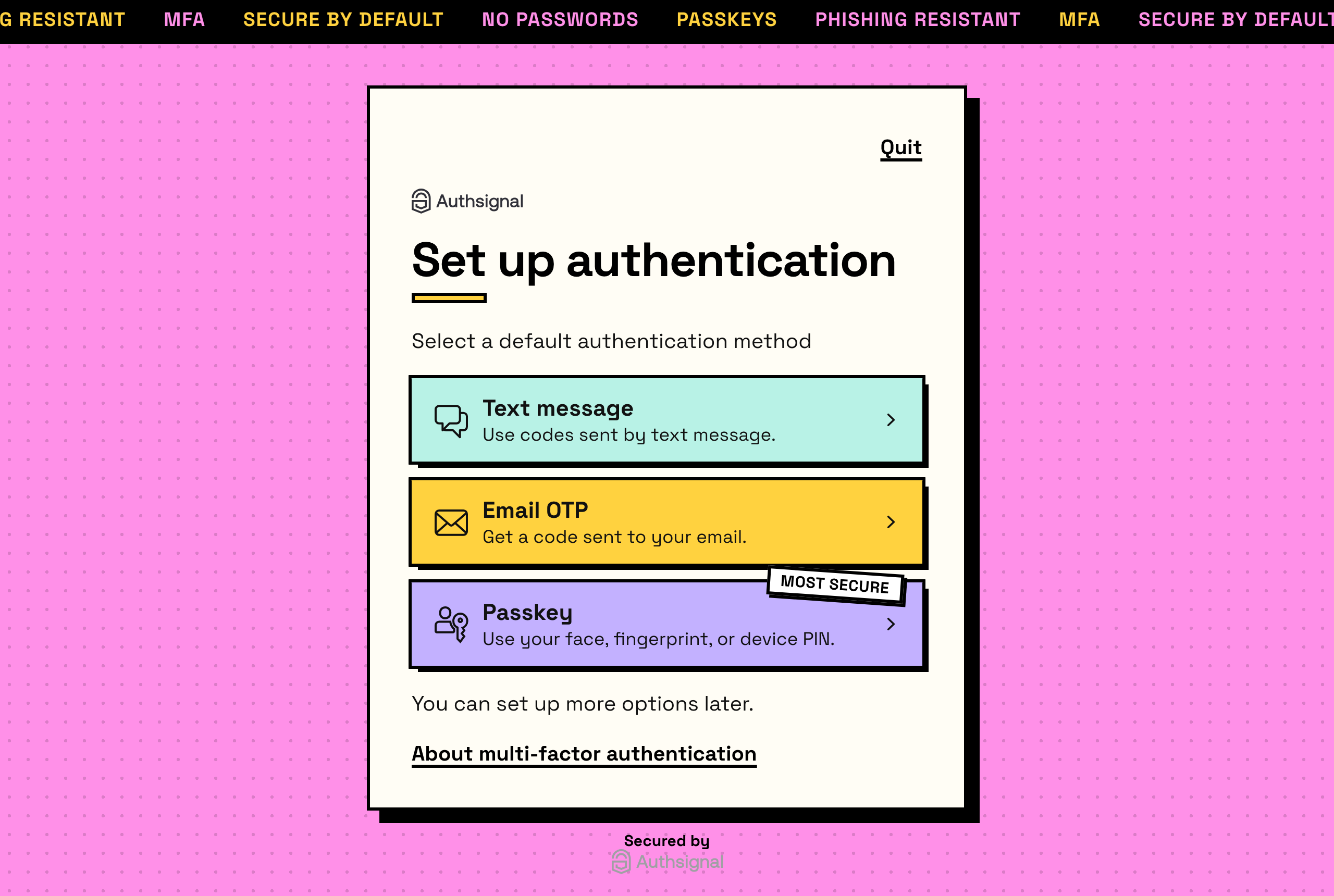
The primary color is yellow, every border color is black, borders are 3px wide and the corners are square. The font is Space Grotesk, loaded from jsDelivr through the typography token, with each font file listed alongside its weight:
"typography":{
  "text": {
    "faces": [
      { "url": "https://cdn.jsdelivr.net/npm/@fontsource/space-grotesk@5/files/space-grotesk-latin-400-normal.woff2", "weight": 400 },
      { "url": "https://cdn.jsdelivr.net/npm/@fontsource/space-grotesk@5/files/space-grotesk-latin-700-normal.woff2", "weight": 700 }
    ]
  }
}
Font files need to be woff or woff2, and the host has to allow cross-origin requests. Otherwise the browser blocks the file and the pre-built UI falls back to its default font.
A short template handles the rest. It adds hard offset shadows, gives each sign-in method its own background color, and turns the "Most secure" badge into a sticker:
.Container {
  border-width: 3px !important;
  box-shadow: 12px 12px 0 #000!important;
}

#widget-container li:nth-child(4n + 1) .card-shadow > div { background: #b8f2e6!important; }
#widget-container li:nth-child(4n + 2) .card-shadow > div { background: #ffd23f!important; }
#widget-container li:nth-child(4n + 3) .card-shadow > div { background: #c3b1ff!important; }

#widget-container li span.rounded-b-lg {
  transform: rotate(4deg);
  border: 3px solid#000;
  background: #fff!important;
  text-transform: uppercase;
}
The card colors use nth-child, so any sign-in methods you enable later pick up a color automatically.
.png)
Dark mode
When a visitor's device is set to dark mode, the pre-built UI uses the colors in the theme's darkMode object instead. Our Vercel-inspired theme was designed dark first.
.png)
"darkMode": {
  "primaryColor": "#EDEDED",
  "colors": {
    "buttonPrimaryText": "#0A0A0A",
    "containerBackground": "#0A0A0A",
    "headingText": "#EDEDED",
    "bodyText": "#A1A1A1",
    "link": "#3DD68C"
  },
  "pageBackground": { "backgroundColor": "#000000" }
}
If your template adds colors of its own, they need dark versions too. The pre-built UI adds a dark class to the <html> element in dark mode, so we kept the template's colors in CSS variables and overrode them under :root.dark:
:root {
  --ring: rgba(0, 0, 0, 0.08);
  --badge-bg: #e3f8ee;
  --badge-fg: #0a7f5a;
}
:root.dark {
  --ring: rgba(255, 255, 255, 0.1);
  --badge-bg: #0e2a1f;
  --badge-fg: #3dd68c;
}

#widget-container {
  border: none !important;
  box-shadow: 0 0 0 1px var(--ring), 0 8px 16px -4px rgba(0, 0, 0, 0.06) !important;
}
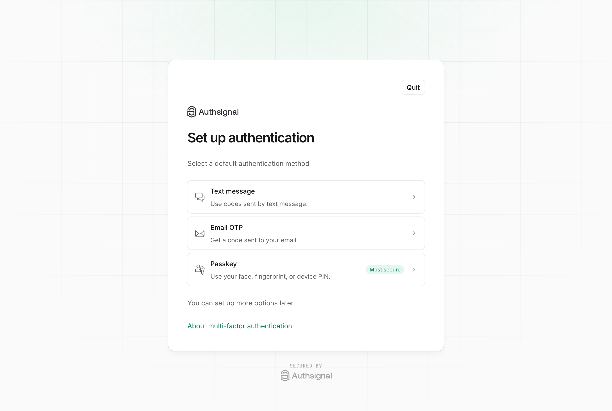
Most of the look comes from that box-shadow. Vercel's design system outlines surfaces with a 1px ring instead of a border, and because the ring's color is a variable, it adjusts to the mode. Here's the same theme in light mode:
Changing the layout
Tokens can't rearrange the page, but template CSS can. Google's sign-in page puts the heading on the left and the form on the right, while the pre-built UI stacks everything in a single column. Our Google-inspired theme uses CSS grid to split it into two columns on wider screens.
.png)
@media (min-width: 900px) {
  #widget-container {
    max-width: 1040px !important;
    width: 1040px;
    background: linear-gradient(90deg, var(--panel) 0 456px, var(--container-background-color) 456px) !important;
  }
  #widget-container main {
    display: grid;
    grid-template-columns: 360px 1fr;
    column-gap: 96px;
  }
  #widget-container main > * { grid-column: 2; }
  #widget-container main > h1,
  #widget-container main > h1 + p { grid-column: 1; color: var(--on-panel); }
}
Below 900px the media query doesn't apply, and the page goes back to a single column on phones.
The rest of the theme is tokens for Google's colors, rounded corners and the Roboto font, plus some template CSS. That CSS groups the sign-in methods into one list with a tinted circle behind each icon, as Material 3 does, and replaces the loading spinner with four colored dots.
Adding your own markup
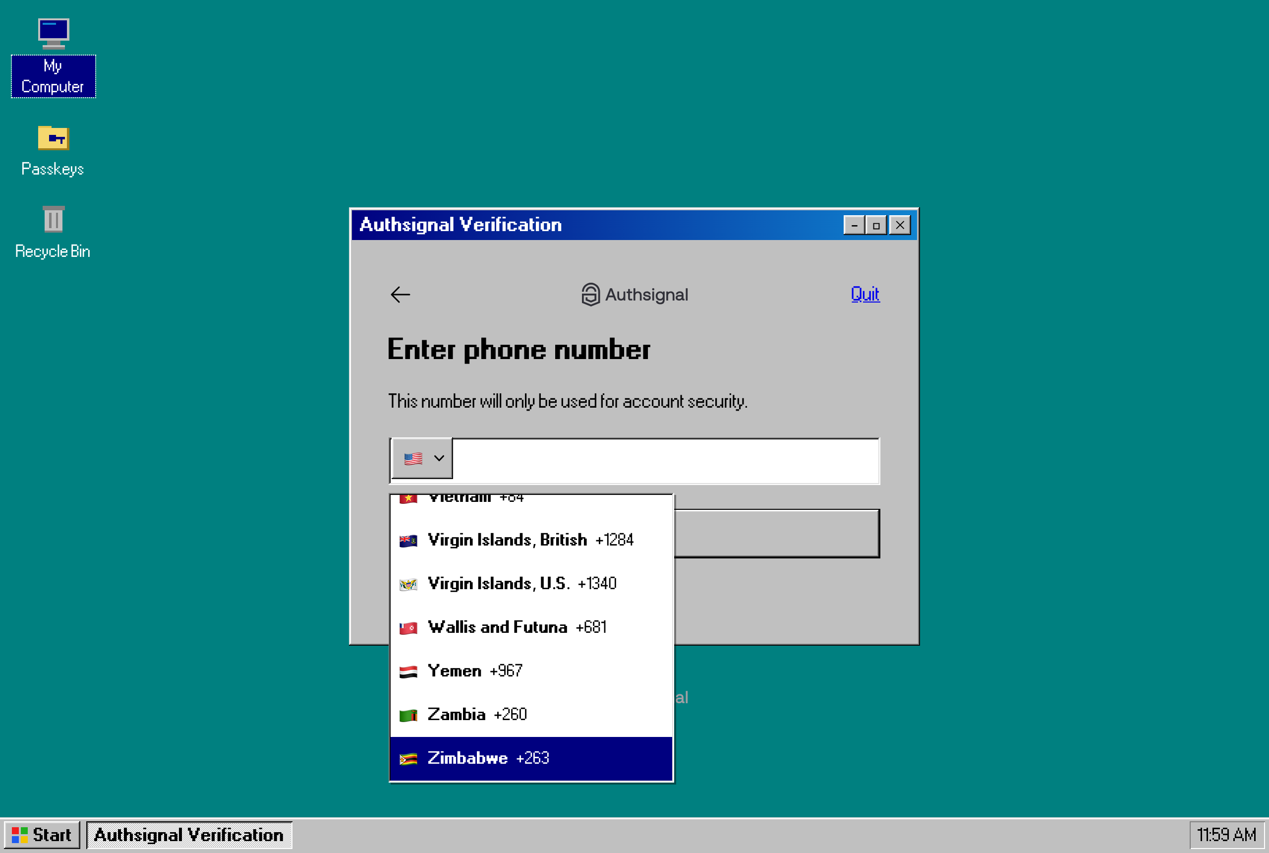
Templates aren't limited to CSS. You can add your own HTML too, and our Windows 98 theme uses it to build a desktop around the pre-built UI.
.png)
The taskbar, the Start button and the desktop icons are ordinary elements in the template's body, placed next to the widget:
<body>
  <div class="w98-taskbar" aria-hidden="true">
    <span class="w98-start"><i></i>Start</span>
    <span class="w98-task">Authsignal Verification</span>
    <span class="w98-clock">11:59 AM</span>
  </div>
  <authsignal-widget></authsignal-widget>
</body>
The window's title bar and its minimize, maximize and close buttons are CSS pseudo-elements, so they don't need any markup. Windows 98 used the same raised and sunken bevels on almost every surface, so the template defines them once as CSS variables and reuses them on buttons, cards, inputs and scrollbars:
:root {
  --raised: inset-1px -1px #0a0a0a, inset1px 1px #fff, inset-2px -2px #808080, inset2px 2px #dfdfdf;
  --pressed: inset1px 1px #0a0a0a, inset-1px -1px #fff, inset2px 2px #808080, inset-2px -2px #dfdfdf;
}

.Button { box-shadow: var(--raised); }
.Button:active { box-shadow: var(--pressed); }
The pixel font comes from the open source 98.css project.
Try it
The four themes are in the authsignal-custom-themes repo on GitHub. Each one has a theme.json with its tokens and a template.html. The branding docs list every token, and the Update Theme reference has the full schema. You can also manage the theme in Terraform with the authsignal_theme resource in the Authsignal provider.